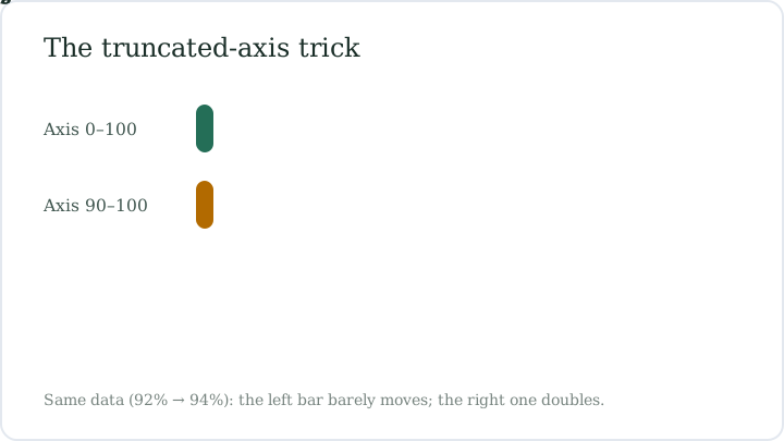
Survey support doubles in three months, announces the chart — and the bars agree, one towering twice as high as the other. The underlying numbers moved from 92% to 94%. Nothing in the chart is technically false; the axis just starts at 90 instead of 0. Percentage charts are easy to draw and easier to bend, and this guide is a tour of how. It ends with a checklist that takes five seconds to run on any chart you meet, including the figure shown alongside this page.
Mistake 1: The axis that starts too high
A bar chart of approval ratings runs from 90 to 100. Support moves from 92% to 94% — a two-point change — but the bars measure from 90, so one is 2 units tall and the other 4: the taller bar looks double. The figure beside this text shows the setup: the same two values drawn once with an axis cropped to 90–100 and once from zero, and the drama moves out with the crop. Why it fools you: bars read as quantity, and quantity starts at zero. The fix is to find the bottom of the axis before believing any bar chart; if it is not zero, read the labels or redraw the change as a line.
Mistake 2: Twice the number, four times the ink
Some charts scale pictures and bubbles so that doubling a value doubles a length — but area grows with the square of length. Double a circle's radius and its area quadruples, so a 2× difference is drawn with 4× the ink. Chunky 3D bars do the same, adding depth and shadow your eye tallies up as size. Why it happens: chart software maps values to radius by default, and readers compare ink, not numbers. The fix: trust the printed values over the shapes, and mentally cut any dramatic bubble chart down by half before deciding it matters.
Mistake 3: Huge percents on tiny bases
A headline reading Burglaries up 100% is technically true if a town of 1,200 went from 2 incidents to 4. The percent is real; the base is minuscule. Percentage change hides scale: moving from 2 to 4 and from 2,000 to 4,000 both print as +100%, though one is a rounding error and the other a crisis. Small denominators are why charts about new products, rare diseases, and small towns swing wildly year to year. The fix is to interrogate the base before reacting:
- Percent of how many? Ask for the raw counts behind the bar.
- Starting from what? One bad month can own the whole percentage.
- Is the base large enough for the percent to mean anything at all?
Mistake 4: The pie chart with fourteen slices
A pie sliced into a dozen wedges turns leader and afterthought into identical slivers — 7% and 9% look like the same slice, and the 2% wedges blur into one gray mass. Ordering becomes a design choice rather than data, so the eye ranks by color contrast instead of size. Pies also collapse when totals shift between two charts, since every slice's meaning depends on all the others. Why it persists: circles look friendly in reports. The fix: more than five or six categories belongs in a sorted bar chart, with the crumbs lumped honestly into an other slice.
Mistake 5: Time windows that quietly change
A slide brags that revenue grew 22% this quarter and 40% over the last 18 months — two windows, two lengths, no comparison. Percent growth depends entirely on the interval it is measured over: 40% across 18 months could be slower than 22% across 3. Some dashboards switch from year-over-year to quarter-over-quarter mid-chart, letting each segment pick its most flattering frame. Why it works: the label sits in small print under a very large number. The fix is to make the windows equal, or annualize everything before comparing, and to read the fine print where the definition hides.
Mistake 6: The convenient start date
An investment fund's five-year chart begins the month after a market crash — the trough — so every point after it is measured from the lowest possible base and the line soars. Move the start six months earlier and the same fund looks flat. Percent change has no meaning without its start point, which is exactly why the start point gets chosen with such care. Why it works: the eye anchors on the left edge and never asks about it. The fix: ask what date the line begins, then imagine it moved. If the story survives any start date, believe it; if not, you have found the trick.
The five-second chart checklist
Run these checks in order on any chart you meet, especially one already cropped to fit a slide or a social feed. Together they take about five seconds, cost nothing, and catch nearly every trick catalogued above. Over time they become reflex, with the eye going to the axis before it goes to the headline — and that reorder, numbers first and narrative second, is the whole defense against charts drawn to persuade rather than to show. The list is short enough to memorize, and it travels:
- Find the bottom of the y-axis: zero, or a chosen start?
- Check the base behind every percent: of how many, starting when?
- Compare printed values, not bar heights, bubble areas, or slice colors.
- Confirm the time window is identical for every series shown.
- Ask what the chart would look like with a different start date.
| Technique | What it hides | How to spot it |
|---|---|---|
| Truncated y-axis | The size of the change — 2 points drawn as 2× | Axis starts above zero on a bar chart |
| Area scaling | A 2× gap shown with 4× the ink | Bubbles or 3D bars sized by radius |
| Tiny-base percents | The absolute numbers behind the percent | +100% with no raw counts given |
| Fourteen-slice pie | True ranking and the many small categories | More than six wedges, no bar version offered |
| Shifting time windows | That different intervals are being compared | Mixed quarter and 18-month labels |
| Cherry-picked start | The base date that flatters the trend | Line begins at a visible trough or peak |
Recompute the numbers behind any suspicious chart with the percentage change calculator before you share it.
Open a calculator →Common questions
Is a truncated y-axis always misleading?
No. Zoomed axes are legitimate for line charts tracking small, meaningful changes, such as temperature or unemployment rates. They mislead most in bar charts, where area reads as quantity — a bar cut off at 90 distorts proportion even when every label is accurate.
How can I tell where a chart's axis starts?
Read the lowest labeled tick on the vertical axis, not the bottom edge of the image. Bars drawn to the frame with the first tick at 90 mean the axis starts at 90, and the whitespace below the bars is where the missing 90 percent went.
Why is 100% growth from 2 to 4 not impressive?
Because the base is tiny. Percent change divides by the starting amount, so small denominators produce dramatic percents: 2 to 4 and 2,000 to 4,000 both read as +100%. Ask for the raw counts before deciding a change matters.
What does cherry-picking a start date mean?
Choosing the base point that maximizes the percentage change, often a trough right before a recovery. Since percent change is measured from the start, that one choice can turn a flat result into a soaring line. Mentally move the start date to test any trend.
Are pie charts ever the right choice?
Yes, for a handful of parts of one whole — roughly five or six slices at most, with the largest starting at 12 o'clock. Beyond that, wedges become unreadable, and a sorted bar chart shows the same data faster and more honestly.
What is the first thing to check on any percentage chart?
The base: what number the percent is taken of, and when the counting started. Most chart tricks — truncated axes, tiny bases, convenient start dates — work by hiding the base. If the base is stated and fair, the chart usually survives scrutiny.
Our team checks formulas against worked examples and reviews every guide for clarity before publication. Spotted an error? Tell us — our editorial policy explains how corrections work.